Humanizing Data
Putting a face on data
To paraphrase Arya Stark from Game of Thrones, I’ve seen data and it’s got many faces.
We are hugely visual beings, and it is this innate human characteristic trait that makes data visualization and storytelling now a highly valued skill across many industries. While analytical thinking is central to understanding patterns and recognizing trends that we see in a myriad of things today, the tremendous amount of data that we generate daily could no longer be interpreted by mere human intuition. Hence, different data processing and visualization tools are developed through the years.
From the conventional excel sheets to the more sophisticated visualization tools such as Tableau or Python Programming, we are now more able to explore data, make them sexy through visualization, and ultimately extract meaningful insights and tangible business values from them.
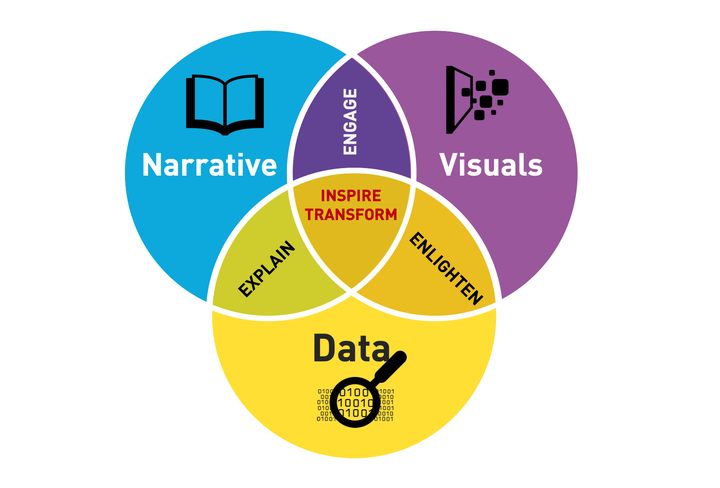
And right after we’ve aligned the analytical stars, we must then inspire action. This inspiration could be drawn out from powerfully compelling stories that we tell our audience through data. In other words, we have to humanize our data by putting a face on it.
Consume, not just produce
But way before we communicate the insights we get from our datasets, one needs to spend a considerable amount of time in exploring them. Problematic data storytelling is usually a result of data explored and experimented in haste.
One of the problems of technical people (usually scientists) in communicating data is that they confuse summary statistics with storytelling. Thousands of infographics are being made, yet very little insights are taken from them. A call to action is perhaps the most important part of our stories. So what? What do you want your audience to do or make out of the story you share with them?
Like what we’ve said time and time again, data analytics is not enough; we must be able to CONSUME the results and not just PRODUCE them.
Numbers “lie” after all
In the realm of data science, some of the most interesting stories are usually taken from data points that demonstrate strong correlation. From these seeming causal relationship between variable do we extract our hypothesis—-possible patterns or trends that we can generalize for a larger population.
Like in most stories, we must begin with the end in mind. We have to have a question that we want to answer. Then we develop several assumptions and validate them through analyzing our data. Note, however, that this should be done in great caution. Sometimes it’s easier to just jump right off a conclusion after seeing the stats, yet the numbers don’t always add up.
As future data scientists, we have to consider the underlying messages—-usually not as apparent as we expect them to be when doing our data analysis. One must be wary of possible outliers that skew our graphs, which might lead us to an inaccurate, if not totally incorrect, insight.
Data-driven decisions
At the end of the day, data is now being used to inform our decisions—-from where to make a real estate investment to the policies that our lawmakers should implement in addressing a societal issue. Through effective data visualization, we are able to decide on different matters not just with our lucky hunches, but rather with hard evidence.
This essay was a requirement under the DVS class and has been published with permission from the author, one of my MSDS students. - Prof. E