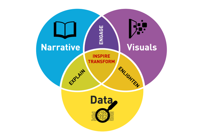
Data Visualization and Storytelling
In this course (DVS), students learn to appreciate the importance of successful data visualizations and intelligible data-driven stories in communicating actionable insights.
Apr 23, 2019
The visualization in “data visualization” does not actually refer to how visually appealing your figure or chart is, but in how well it enables others to visualize the data you are trying to communicate. At the end of the day, we are communicators speaking through the language of data, and most of the time, our best vehicle for our chosen language is in the visualizations that we produce.
The most memorable and most influential people in one’s life are the good storytellers. What we normally consider as the most memorable teachers in our younger years were the ones who connected with you and told the best stories. Such is the same takeaway from this course as I begin my journey in data science. This course will hopefully remind me that at the end of all the technical, mathematical, analytical work that one will do, and all the lines of code that will be written, you have to tell a good story. Good stories will inspire you. Good stories will call people to action. The stories told by a person help perpetuate the influence of that person long beyond the time the story is told.
'Soft skills' like visualization and storytelling are oftentimes not being given the same attention as the technical skills; but, if you think about it, your visualization and how you present your findings in the language of your stakeholders **is the only part of your analysis that your audience ever sees**. To aspiring data scientists and even professionals, may we all not suffer from the pain of our analysis being neglected just because we failed to communicate it well.
That is the main idea of the class. Facts are concrete and undeniable but it is faster to grasp the concept of the data used if it is dressed up with graphs and other visualizations. I learned some tricks into making those pretty pictures from the class. More importantly, the course makes you realize that it isn’t enough to just have something to look at. What’s more important is having a flow that guides the audience on a path on whatto look at and count as important. In the class, those tricks and tips were introduced and the help it gives shouldn’t be underestimated.
Data visualization is always about communicating information. Most of us fall into the trap of visualizing for the sake of visualizing to the point that the entire point of the analysis is lost. For example, plain, bold text telling you an important statistic is way more effective than a fancy pie graph with more than seven partitions simply because it communicates the information better. Likewise, a visualization of a small slice of the data is better than visualizing everything if you’re only really concerned with the small portion.
Our exercises with applying traditional statistical methods on tricky data sets really stuck with me. If I were alone and did not know any better, I would have committed the exact mistakes that the course has taught me to avoid. Before this course, all I had was a hammer and everything looked like a nail. All in all, I would sum up this course as a tool kit. It has given me more than enough to work with such that now when I am exploring new data, I can be present them more confidently.
Building on the idea of people coming from various backgrounds, it has been established that the industries around us today works in a dynamic and interdisciplinary way. One must be able to appeal and communicate to a wide variety of audiences across the different markets and industries. This is where the union of communication and data analysis is emphasized. Data visualization is instrumental to comprehensively communicate research analysis and results but for this to translate into concrete actions, it must be understood by the different stakeholders at hand.
One of the problems of technical people (usually scientists) in communicating data is that they confuse summary statistics with storytelling. Thousands of infographics are being made, yet very little insights are taken from them. A call to action is perhaps the most important part of our stories. So what? What do you want your audience to do or make out of the story you share with them? Like what we’ve said time and time again, data analytics is not enough; we must be able to CONSUME the results and not just PRODUCE them.
On how you would tell a story and designing your presentation is only limited to your imagination and will depend on the type of audience you have. There are a lot of tools or software to create your presentation form excel, powerpoint to the more sophisticated ones like tableau and gephi. It does not need to be the grandest presentation but as long as you were able to convey your message to the audience is what is important.
It is important to plant a data visualization and a storyboard culture in all the data science organization because at the end, it is the story which people buy or fall for. From my past experience in a data science startup, I could now visualize while reminiscing that it was the lack of this culture which made the job look dull and pale. Thus, acumen in storyboarding is an automatic big plus to excel in the journey of data science. For the next batch, think of your persona when you are playing some mobile or desktop game, it’s just the engagement that is required, because in my opinion, DVS was by far the best fun subject that ever happened to me.