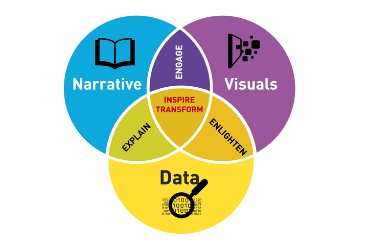
We are communicators speaking through the language of data.

Prior to the start of DVS class, if you had asked me what a “good visualization” is, I would have told you that the best visualizations are the very complex and intricate ones that require intense effort on the part of the creator. These are the visualizations that I would associate most with the “data visualization”; those that are used for mapping networks or complicated custom ones that are seemingly impossible for the normal regular Joe to create, and have that WOW factor that leaves you in awe of just how beautiful a work of art their visualizations are. This stands in stark contrast to what I now believe should be a good visualization. Whereas most people would focus on the visual aesthetic part of it, making sure to be as flashy as possible or as cutting-edge with their visualizations as they can, I now believe that a truly good visualization should be one that is simple, concise, and easily understandable. After all, if the main goal of a good visualization is to get the point across in the fastest and most efficient way, I wouldn’t consider those overly complicated ones as “good visualizations”.
There are two sides to this realization: the first being that not all simple visualizations are necessarily also concise, intuitive, or informative. We learned about the pitfalls of the mighty (or not) pie chart and the proper context in which these can be deployed. Secondly, I’ve come to realize that the best simple visualizations almost always require the most thought given to it by the creator. As we’ve come to experience in real life with our final project visualizations, creating a simple and intuitive one is one of the hardest tasks that you can do. To paraphrase a popular saying, “there is more to data visualization than meets the eye.”
Additionally, I realize now just how much responsibility we have as future data scientists to present our findings and be able to communicate them in terms that will not only be readily understandable to the general public, but also in forms that would not be misleading. One poorly made visualization could convey the opposite of what it is meant to, and in the wrong hands, this could lead to catastrophic decision-making. It is therefore our job to be able to create visualizations that would efficiently and intuitively communicate its purpose so that we may convince, inform,and help decision-makers from different fields to evaluate their problems or strategies in a more data-driven way.
Finally, my last takeaway from our time in DVS is that the visualization in “data visualization” does not actually refer to how visually appealing your figure or chart is, but in how well it enables others to visualize the data you are trying to communicate. At the end of the day, we are communicators speaking through the language of data, and most of the time, our best vehicle for our chosen language is in the visualizations that we produce.
This essay was a requirement under the DVS class and has been published with permission from the author, one of my MSDS students. - Prof. E